In the previous two columns (January/February and April 2016), we looked at the basic ideas behind control charts, saw how to construct the common X-bar and R charts and discovered that only two rules are normally necessary for detecting out-of-control situations. In this column we’ll come to understand that if a process is “out of control” it doesn’t necessarily mean that the process is “out of specification,” and that being “out of specification” doesn’t necessarily mean that the process is “out of control.”
This column is adapted from Don Wheeler’s original pamphlet, Four Possibilities.1 The material was later incorporated into the first chapter of his excellent book, Advanced Topics in Statistical Process Control: The Power of Shewhart’s Charts.2 Though Wheeler discusses only four possibilities, I’ll split one of them to make a total of five.
Figure 1 shows a four-quadrant diagram that includes Wheeler’s possibilities: the ideal state, threshold state A, threshold state B, the brink of chaos and the state of chaos. We’ll discuss these one at a time. Before leaving Figure 1, though, note that there are two orthogonal axes. The vertical axis poses the question, “In statistical control?” The horizontal axis asks the question, “Within specifications?” In mathematics, when two axes are orthogonal to each other, it means they have no effect on each other.
 Figure 1 – Statistical control and specifications.
So, too, in this figure. The questions “In statistical control?” and “Within specifications?” are completely independent and have no effect on each other. In particular, they are not equivalent questions.
The ideal state is shown in Figure 2. In the upper run chart, all of the values conform to the specifications. If we were to answer the question, “Within specifications?” we’d have to say that there’s no evidence that it’s out of specification, so, “Yes, the process appears to be within specifications.” In the middle and lower charts (the control charts), there is no evidence of any three-sigma rule violations or run-of-ten rule violations. If we were to answer the question, “In statistical control?” we’d have to say that there’s no evidence that it’s not in control, so, “Yes, the process appears to be in statistical control.” Note that the control limits in both of these charts are fairly tight, suggesting a small amount of variation in the process. This is truly the ideal state, approaching Taguchi’s ideal of “on target with minimum variance.”3
 Figure 2 – The ideal state.
Figure 3 represents what I’ll call “threshold state A.” In the middle and lower control charts, there’s no evidence that the process is not in control, so we’d have to say, “Yes, the process appears to be in statistical control.” But when we look at the upper run chart, not all of the values conform to the specifications; in fact, we’re making a lot of out-of-specification product, and it’s all above the upper specification limit (USL). So, “No, the process is not in specification!”
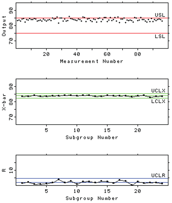 Figure 3 – Threshold state A.
As it turns out, this isn’t a terribly bad situation to be in (as shown by the half-smile for threshold state A in Figure 1). For a manufacturing process, the engineers know which inputs to tweak to center the process between the specification limits—maybe adjust the pH, a flow rate, a temperature. For a measurement process, the analysts know which inputs to tweak to center the process between the specification limits—maybe recalibrate, replace the UV lamp in the chromatographic detector, whatever. Unfortunately, managers come to believe that the “troops in the trenches” (the engineers, the analysts) can always fix these problems—all they have to do is yell a bit and, as if by magic, the process comes back in spec.
Figure 4 represents what I’ll call “threshold state B.” In the middle and lower control charts, there’s no evidence that the process is not in control, so we’d have to say, “Yes, the process appears to be in statistical control.” But look at how wide the control limits are! That suggests there’s a lot of variation in the process. In fact, when we look at the upper run chart, not all of the values conform to the specifications. We’re making a lot of out-of-specification product, but … hey! Now it’s out of specification both high and low! Some of the out-of-spec material is above the USL, and some of the out-of-spec material is below the lower specification limit (LSL). So, “No, the process is not in specification!”
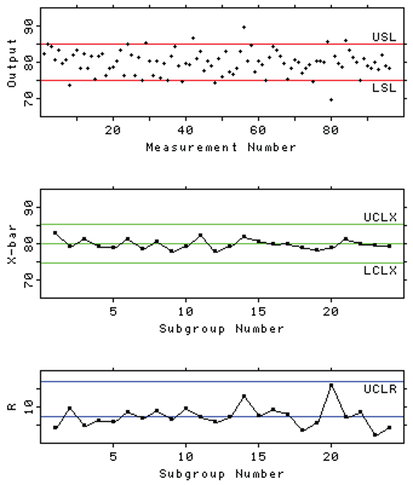 Figure 4 – Threshold state B.
This is a terribly bad situation to be in. The problem isn’t one of “centering” the process, as it was in threshold state A. Here, the process is about as well-centered as we could ever hope for. The problem is excessive variation. If management thinks they can yell at the troops in the trenches and magic will happen, they have another think coming. This isn’t an engineering problem or an analyst problem—excessive variation is a management problem, as Berger and Hart point out so well in their book.4 Management will have to find the cause(s) of this excessive variation and take steps to reduce that variation. They might have to replace worn-out equipment, find better suppliers of raw materials, retrain personnel. … It’s going to take time; it’s going to be expensive; it’s going to take management’s involvement. This is not a nice state to be in; hence the serious frown for threshold state B in Figure 1.
Figure 5 shows the brink of chaos. It’s curious— the process is in specification, but it’s not in a state of statistical control. So why the huge frown in Figure 1? Because management probably isn’t going to do anything about it! It’s in spec, right? Hey, if it ain’t broke, don’t fix it. But those in the know (engineers, analysts, statisticians) have learned that the brink of chaos is a train wreck waiting to happen. Look at the run chart. Do you believe the string of values between measurement numbers 33 and 41? The data are too good! Valid data doesn’t look like that. There are three-sigma rule violations in the X-bar chart. And the R chart shows wild variations in the amount of variation (yes, that’s what I said … wild variations in the amount of variation). This process is already out of control, and it will probably go out of specification soon. Can you visualize Edvard Munch’s painting, The Scream? That’s how frustrating the brink of chaos is—the troops in the trenches know there’s a problem, but management probably won’t do anything about it.
 Figure 5 – The brink of chaos.
Finally, Figure 6 shows the state of chaos. We could spend another whole column discussing this figure. But you get the idea. It’s clearly not in a state of statistical control, and it’s clearly not in specification. I can remember William Edwards Deming talking about this in one of his seminars for managers. His opinion was (if I remember correctly) that managers thought their processes were always in the ideal state, but more often than not their processes were in this state of chaos. Deming would throw up his hands and ask, “How would they know? How would they know?” meaning that if they didn’t make control charts like these, how could they know that their processes weren’t in the ideal state they thought they were in?
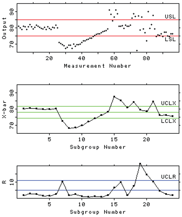 Figure 6 – The state of chaos.
The state of chaos isn’t such a bad state to be in, though (see the half-smile [or is it a smirk?] in Figure 1). Engineers and analysts and statisticians know that this state is going to get the attention of management … because the process is making a lot of out-of-spec material that can’t be sold. And nothing gets management’s attention like profit or loss.
But be careful. Management will want you to go counterclockwise in Figure 1 and get back in specification before you worry about getting back in control. It won’t work. You’ll go to the brink of chaos and then … you’ll go back to the state of chaos, and simply oscillate back and forth. As any experienced statistician will tell you, you have to go clockwise—first get the process in statistical control (either threshold state B or, better, threshold state A) and then bring it back to the ideal state.
Control charts? They’re just tools. What’s important is to interpret them, and take appropriate action, if it’s called for. The charts by themselves won’t improve the process (or prevent entropy from taking you out of the ideal state, as Wheeler points out2). You have to look at to these charts and take action, if necessary. Again, don’t wait until the end of the month to make these charts, or your opportunities will be lost.
So what will we talk about in the next column? I’m not sure. What are you interested in? Let me know.
References
- Wheeler, D.J. Four Possibilities; Statistical Process Controls, Inc.: Knoxville, Tenn., 1983.
- Wheeler, D.J. Advanced Topics in Statistical Process Control: The Power of Shewhart’s Charts; SPC Press: Knoxville, Tenn., 1995.
- Nair, V.N.; Abraham, B. et al. Taguchi’s parameter design: a panel discussion. Technometrics 1992, 34(2), 127–61.
- Berger, R.W. and Hart, T.H. Statistical Process Control: A Guide for Implementation; ASQC Quality Press: Milwaukee, Wis., 1986.
Dr. Stanley N. Deming is an analytical chemist masquerading as a statistician at Statistical Designs, 8423 Garden Parks Dr., Houston, Texas 77075, U.S.A.; e-mail: [email protected]; www.statisticaldesigns.com